Overview
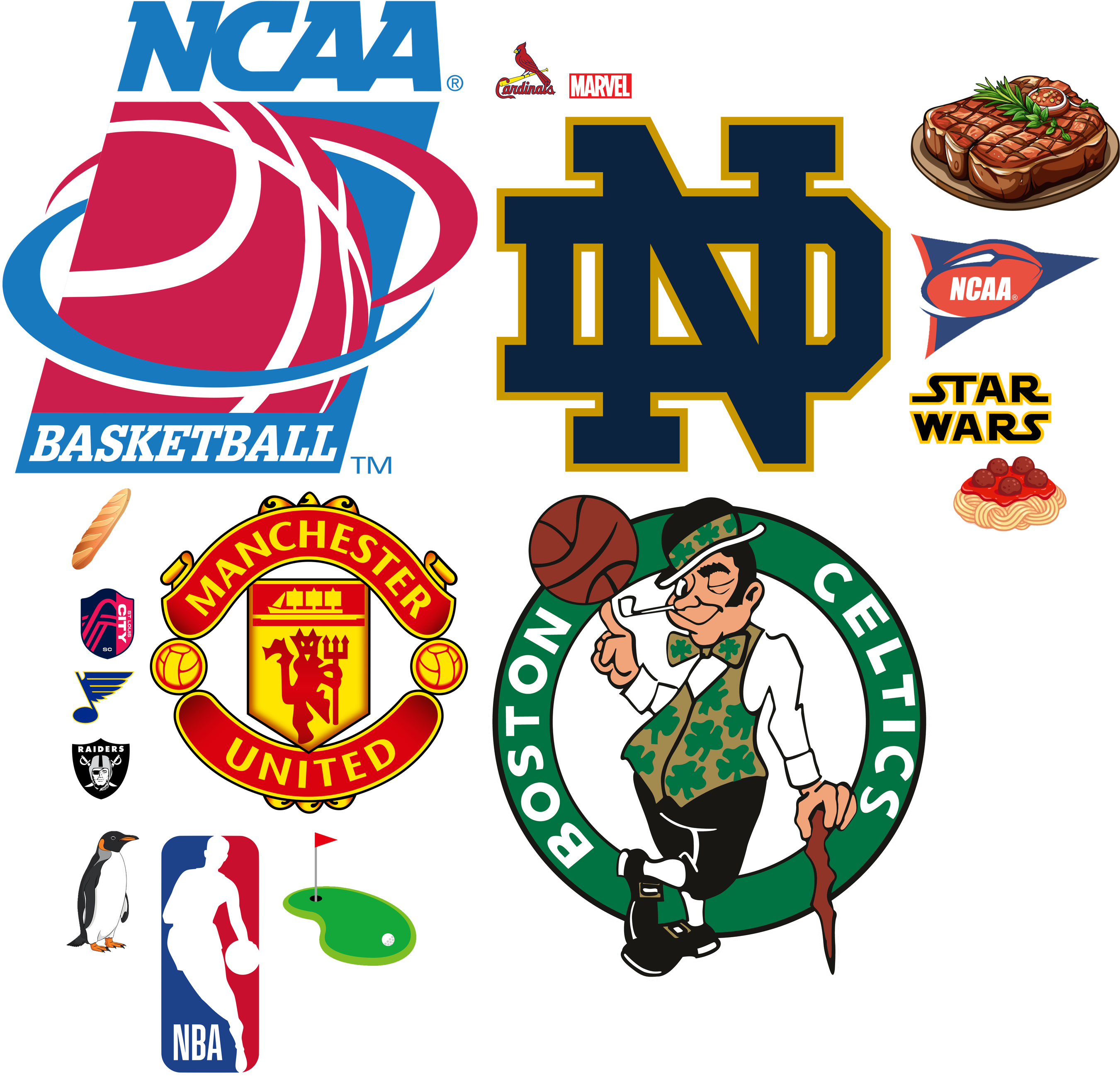
I had my family and friends fill out a form where they ranked my top 17 interests in order, 1-17. Based on these results I created this image, where the size of each logo is inversely proportional to the numerical rank (so #1 appears largest).
Using Python, I took the data from my survey, created a DataFrame with a row for each interest and its average rating. The final visualization was generated via the Pillow library, with the scale of each logo determined by its average rating.
Gallery